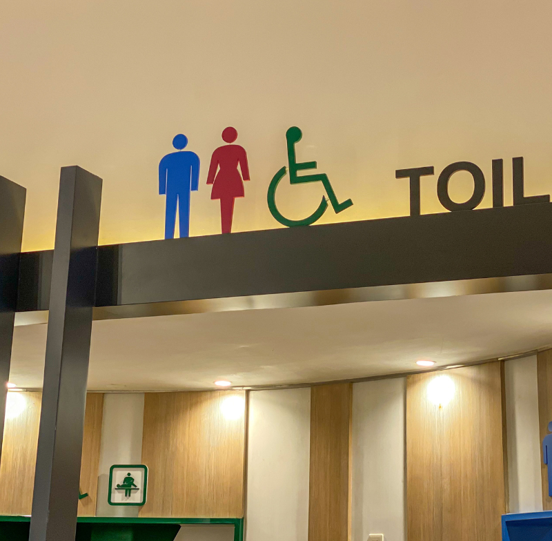
When we think of disability, most people imagine the well-known blue badge displayed in cars to access disabled parking bays. But across the UK, a much wider world of colours, ribbons, badges, and flags exists to represent and support people with disabilities and long-term conditions. These symbols carry meaning, advocacy, and pride — yet they can also create confusion when their variety isn’t clearly understood. In this post, we’ll explore what these disability colours stand for, how they’re used, and how they help promote awareness, inclusion, and respect for disabled people.
The Official Blue Badge – Access and Recognition for All Disabilities
The Blue Badge scheme is one of the most visible and official symbols of disability recognition in the UK. It’s issued by local authorities under government regulation and allows people with severe mobility problems to park closer to their destination. While most people associate it with visible physical disabilities, the rules now recognise that hidden disabilities such as autism, anxiety, or severe mental health conditions can also qualify. The badge is blue for consistency across all regions and is recognised in many parts of Europe as well. It isn’t tied to a specific type of disability — rather, it’s a practical and inclusive symbol of accessibility and mobility rights.
The Rise of the Sunflower Lanyard
One of the most successful awareness symbols in recent years is the Hidden Disabilities Sunflower Lanyard. Introduced at Gatwick Airport in 2016, the sunflower design helps discreetly indicate that the wearer has a hidden disability and may need extra time, understanding, or support. It’s now widely recognised in supermarkets, airports, train stations, universities, and even some workplaces. The lanyard’s bright green background with yellow sunflowers is cheerful yet distinctive, and companies like Tesco, Sainsbury’s, and Heathrow Airport have trained their staff to look out for it. Importantly, it’s voluntary — no one is required to wear it — but it gives many people confidence in public spaces.
The Colours of Disability – What Do They Mean?
Colours are powerful communication tools, especially when it comes to representing invisible disabilities. While there isn’t one universal colour system, some shades have become commonly linked to particular causes or communities.
Red
Red is often used for hearing impairments or deaf awareness in the UK. It’s bold and catches attention, which can be useful in signalling communication needs. A red badge or wristband might tell staff in shops or airports that someone uses lip reading or needs written communication. It’s also a common colour for heart-related conditions and medical awareness more broadly.
Yellow
Yellow can represent learning disabilities or neurodivergence, reflecting brightness, positivity, and visibility. It’s sometimes used by people with autism spectrum conditions to indicate that they might require patience or understanding in communication. Yellow is also used in awareness ribbons for conditions such as endometriosis and bladder health, adding to its varied meanings.
Blue
Blue is deeply associated with autism awareness, especially through the “Light It Up Blue” campaign originally led by Autism Speaks. Although this particular organisation has been criticised, blue remains a recognised colour for autism globally. In the UK, it’s also used to represent arthritis and mobility disabilities, linking back to the blue badge. Blue often symbolises calm and trust — qualities that align with inclusion and accessibility.
Green
Green has multiple meanings within the disability community. It’s used by some to represent mental health awareness, symbolising growth and renewal. Green ribbons are also linked to organ donation awareness. In the context of invisible disabilities, a green badge or lanyard can show that the wearer may need support but doesn’t have a visible condition. The sunflower lanyard, for example, uses green as its base colour for this very reason.
White
White often symbolises blindness and visual impairment. The white cane is internationally recognised as a tool for navigation and independence for people with vision loss. Some people use a white cane with a red band to indicate both visual and hearing impairments (deafblindness). White can also represent purity, openness, and accessibility — fitting values for an inclusive society.
Gold
Gold is a colour used in several health-related causes, but it’s particularly significant for childhood cancer awareness. Within disability contexts, gold also symbolises strength, resilience, and excellence — a way to highlight that disability does not mean inability. It’s increasingly used to celebrate disabled achievements rather than to mark disadvantage.
Charcoal, Black, and Grey
These darker tones are often used for chronic illness awareness or to symbolise pain and fatigue. Charcoal ribbons may represent chronic pain conditions, while black can stand for mourning or remembrance of those lost to illnesses or neglect within the healthcare system. Grey is the recognised colour for brain-related conditions, including brain injury and brain tumour awareness. These colours often convey seriousness and depth, acknowledging ongoing struggles that may not be visible.
Purple – Celebrating Disabled Contributions
Purple is one of the most important colours in disability representation today. It symbolises the contribution and power of disabled people in society. The UK’s Purple Tuesday campaign uses it to highlight accessibility improvements and celebrate disabled consumers and workers. It’s also the colour of the Disability Confident scheme, which helps employers recruit and support disabled staff. Purple therefore stands not just for awareness but for empowerment and inclusion.
The Disability Pride Flag – A Symbol of Unity and Strength
The Disability Pride Flag is a relatively new but increasingly recognised emblem. Designed by Ann Magill, it features a charcoal background with a diagonal stripe made up of five colours — red, gold, white, blue, and green. Each stripe represents a key aspect of disability: red for physical disabilities, gold for neurodiversity, white for invisible disabilities, blue for mental health conditions, and green for sensory disabilities. The charcoal background symbolises the barriers and mourning caused by ableism. This updated design improves accessibility by reducing flashing effects for people with sensory sensitivities. The flag is now used worldwide during Disability Pride Month in July and at community events across the UK.
Communication Badges and Company Recognition
More UK organisations are adopting communication badges to support inclusivity. For example, Network Rail and Transport for London have introduced “Please offer me a seat” badges for those who need to sit but may not look disabled. Some airports use colour-coded cards or wristbands to show communication preferences, such as needing extra assistance or preferring minimal verbal interaction. Retailers and venues increasingly recognise these symbols, especially as part of staff training around disability inclusion. However, awareness varies — smaller companies may not yet understand all the meanings behind these colours, which can lead to inconsistent recognition.
The Challenge of Ribbon Overload
Coloured ribbons have long been used to represent medical conditions and disabilities, from the pink ribbon for breast cancer to the blue ribbon for diabetes. But there are now hundreds of different ribbons, each representing a specific illness or awareness cause. While well-intentioned, the sheer number can be confusing and sometimes dilutes the message. Some campaigns now prefer multi-condition awareness events or broader symbols like the Disability Pride Flag to avoid fragmentation.
Towards a More Unified Understanding
The growing variety of disability colours and badges in the UK reflects both diversity and progress. They help people communicate needs, promote understanding, and build communities. Yet, greater public education is still needed to ensure these symbols are recognised and respected. Whether it’s the official blue badge, the sunflower lanyard, or the purple glow of Disability Pride, these colours remind us that disability is part of the human experience — not something to hide, but something to acknowledge, support, and celebrate.
Discover more from The Blue Badge Blog
Subscribe to get the latest posts sent to your email.


Leave a Reply